I was approached by Helen Waddington to create a brand identity and website for her Risk Management consultancy based in Bristol.
After talking with Helen to find out more about HKW Risk Management I commenced sector-specific research in order to ascertain the common brand aesthetic of companies in risk management. Although Helen wanted her brand and website to look professional and serious she wanted to inject some fun and vitality into what is often a formal and staid sector.
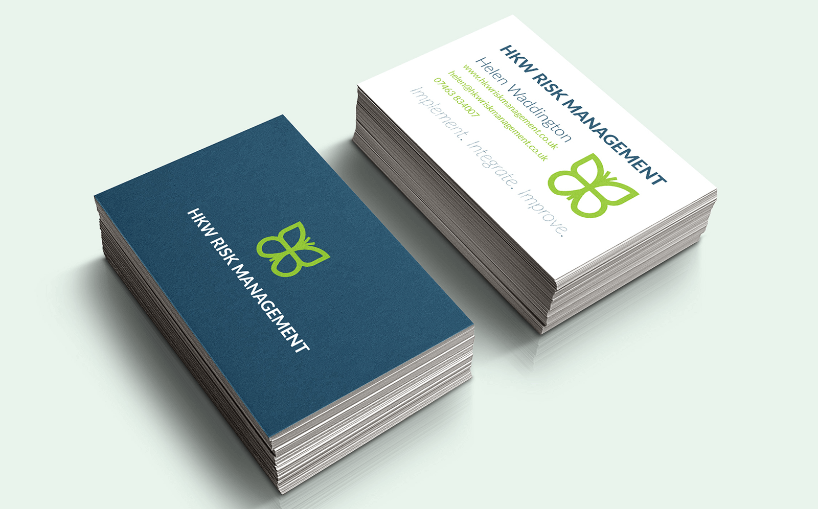
The butterfly logo
![]()
I developed three different logo concepts for Helen and after reviewing each she decided on the butterfly logo. The butterfly was chosen because it emphasises change and rebirth, but also because it connotes the impact that small actions can have on a larger scale. This made it a perfect fit for Helen’s approach to her work.
The dark blue and bright green colour scheme was chosen to provide the balance between formality and vitality that Helen was after. Along with a logo I also produced design for a business card, letterhead and email signature.
See more of my logo design work
The website
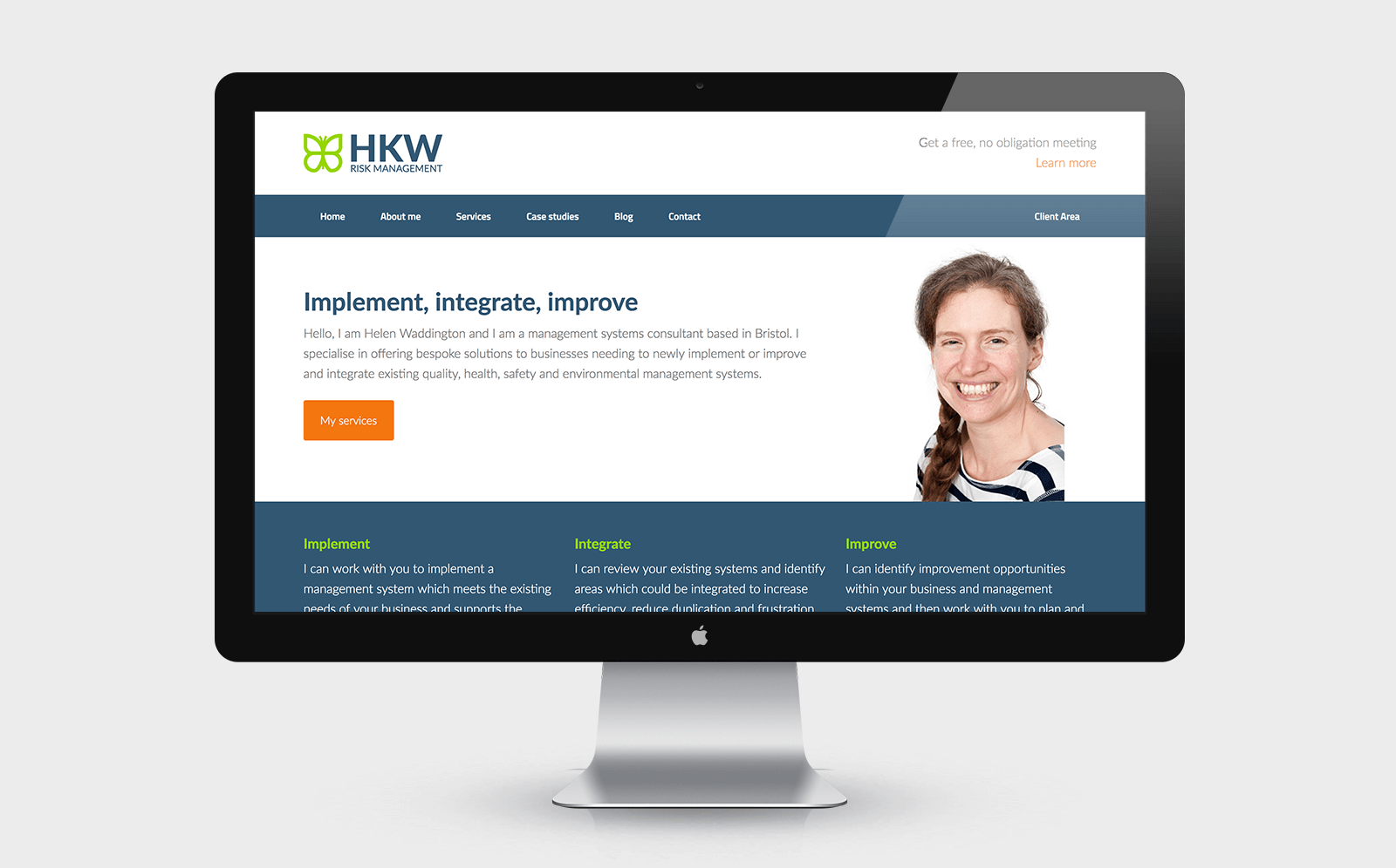

The website was developed using a custom WordPress theme which incorporated Helen’s branding. Helen wanted the website to give an overview of her business, allow her to share her activities through a blog and also provide a portal where she could share documents and assets with her clients. Helen also wanted a portfolio and testimonial section to showcase the recent projects she has worked on.